Booking.com

Problem:
Until now promotional content or campaigns at Booking.com were created and developed by different teams without alignment between these teams. Teams created their own campaigns and this was costly and time consuming. These campaigns were hard coded by developers. Because of this way of of working; one campaign looked totally different than the other. Different teams were fighting for space on the website or stacking different campaigns on top of each other. Which caused banner blindness for the user. There are no specific guidelines on where to place banners, how banners relate to other content, when the user should see it in their journey or how many we can stack at once. Some promotional content shouldn’t be a banner. The design of the banners are different everywhere on the website, there is no consistency. And is the promotional content actually relevant to each user?
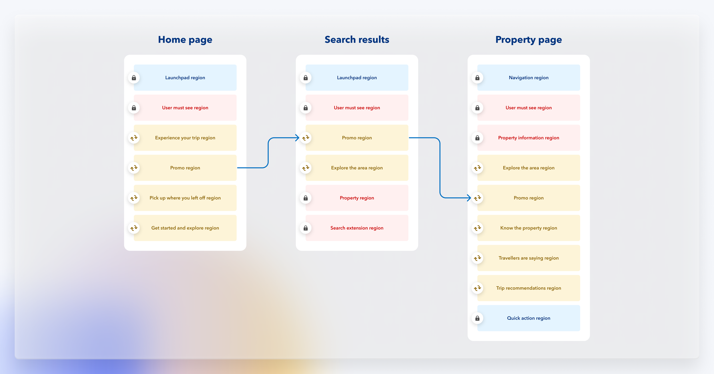
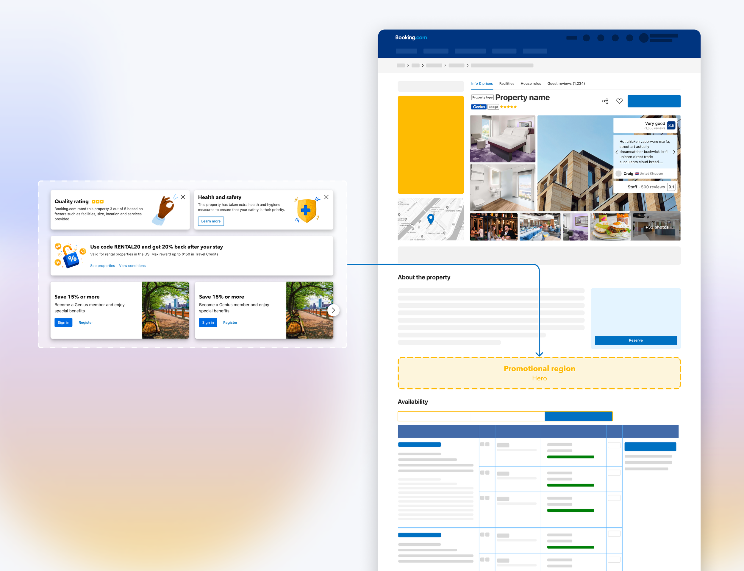
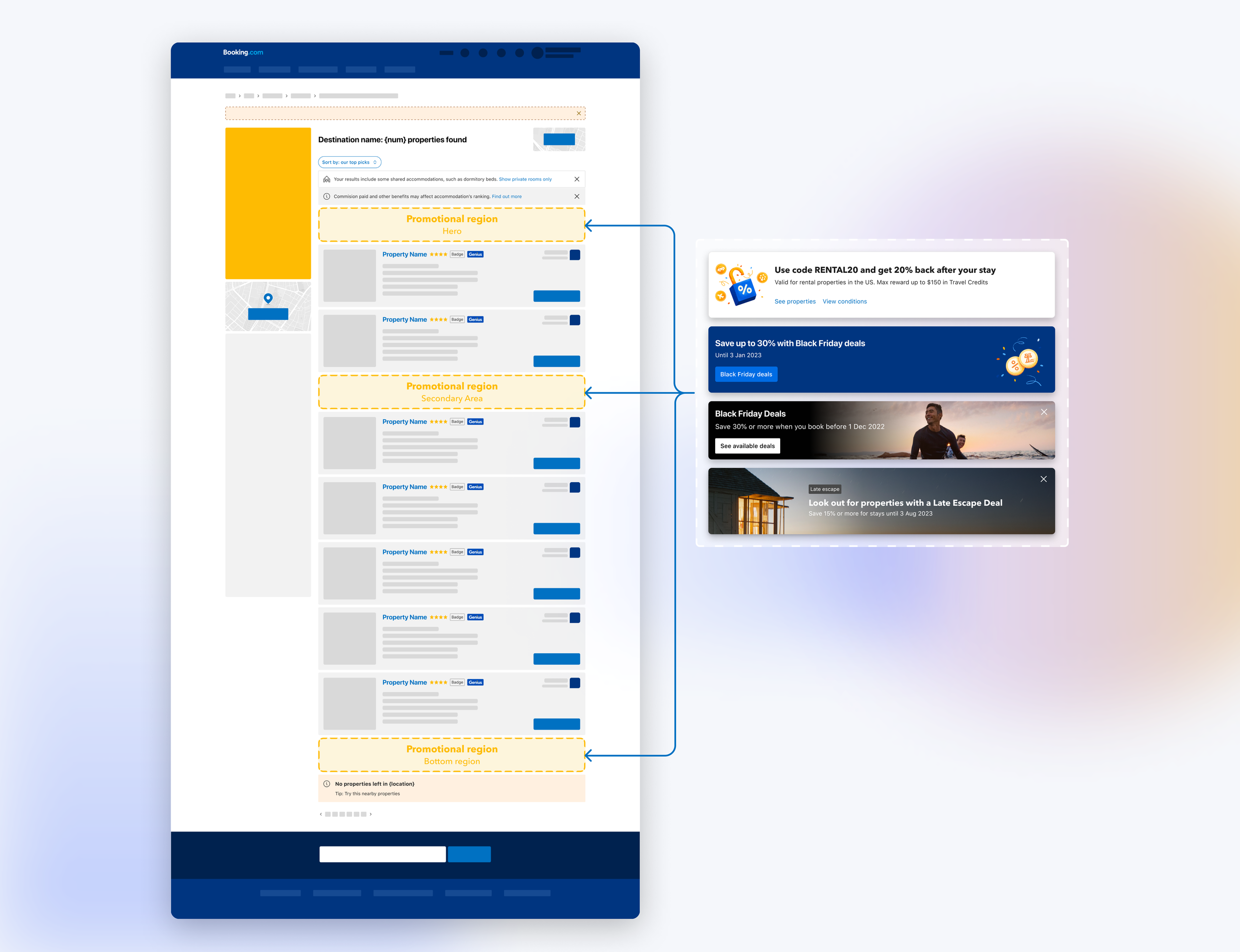
To tackle this problem Booking wants to explore a new type of promotional content called ‘connected patterns’. These patterns can be used on all high traffic pages in dedicated regions. Regions are dedicated spots on a page which are researched and thoroughly tested. My challenge was to create new patterns based on user research, experiments, business requirements and design guidelines. Connected patterns solve the long time to market and enables campaign makers to push one campaign to all platforms in several minutes instead of weeks. The connected patterns they can choose are validated, within the Booking design guidelines, reusable and scalable.
Objective:
By the end of 2023, we want to support low-no code targeted campaigns across the funnel
Mission:
We are on a mission to reimagine effective scalable campaign solutions to successfully connect customers to the most valued offerings. By the end of 2023, we want to support low-no code targeted campaigns across the funnel.
Approach
Research
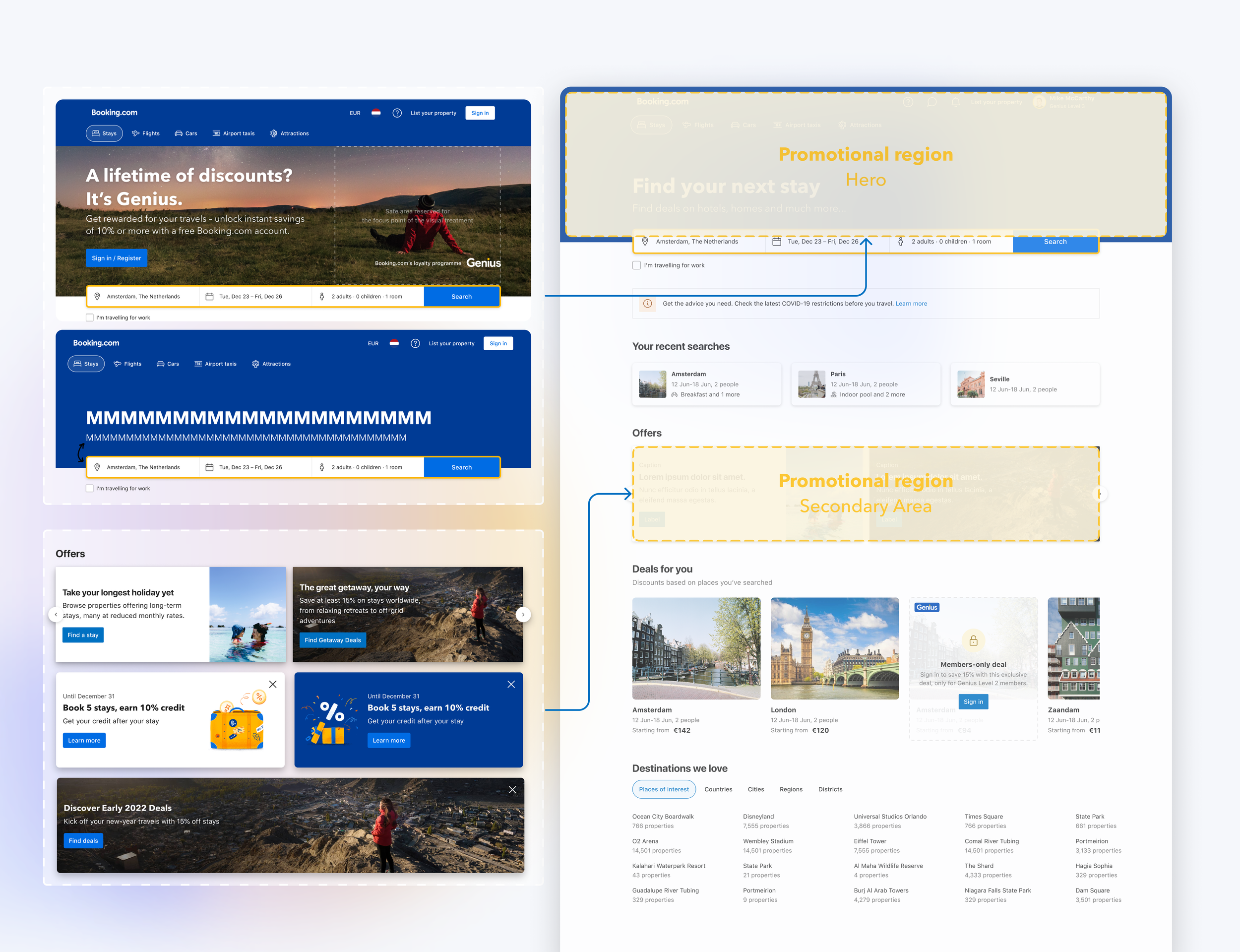
Every region needed to be researched. I would usually start with talking to page owners to understand how users interact with the page and where they are in their journey. Usually page owners already had tested a lot of different areas on the page so this would help with my research. Once I had it all mapped I would start with User Research. Questions I would ask were: Where do you usually go on this page? What are the most important aspects. What do you skip? Next I would show them different types of promotional content and check if they noticed the items on the page. Usually respondents would not even notice promotional content unless it was a big discount if they signed in.
Design
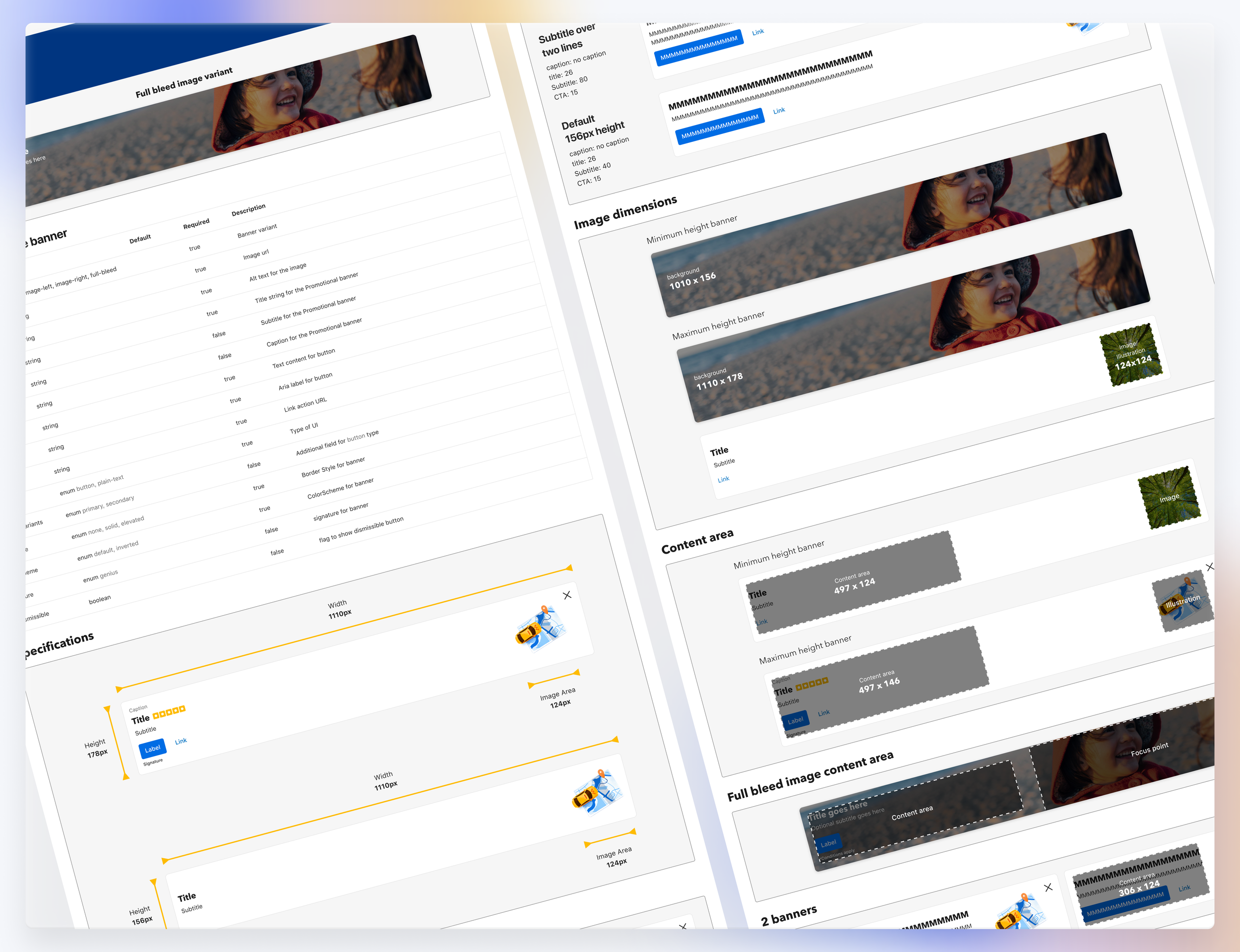
After the user research I would start with designing generic components based on my insights. These components need to be flexible and scalable. Several campaigns can live in one region. This means that one banner can change into 2, 3 or a carousel. These components needed to have different properties which can be switched on or off. For example a campaign maker would need different properties for their campaign. They might need a CTA and a link or just one link. An image background to catch the users attention or just a simple icon. All these variations needed to be possible in one connected pattern so this needed a future thinking attitude.
Experiment
Once the connected pattern was created development would build it and we would immediately test the new component. This was done with A/B testing. We would find out that certain properties like a blue background stood out. A blue background banner above the availability section on the Property Page was killing conversion. It was clear that users got distracted by the blue banner and didn’t continue booking the property. This meant that we needed to write guidelines for each region.
Capabilities:
Connected X-funnel Regions
Enabling validated regions across the funnel. To allow end to end campaign experiences for users. On the homepage, search results, property page and Marketing pages. These regions offer personalisation and segmentation.
Interaction Data:
All components will have tracking capabilities that help product and marketers understand engagement of every campaign launched. As well, this data will be used to enable customer segmentation and personalisation models.
Reusable UX components
Components have a range of capabilities like video and animation. Components are validated and have design variants for flexibility and versatility.
Region governance
We establish priority and hierarchy of content through guidelines, business priority and ranking frameworks utilising Machine Learning modelling to ensure we maximise the potential of each content block.
How do campaign makers create, monitor and manage their campaigns?
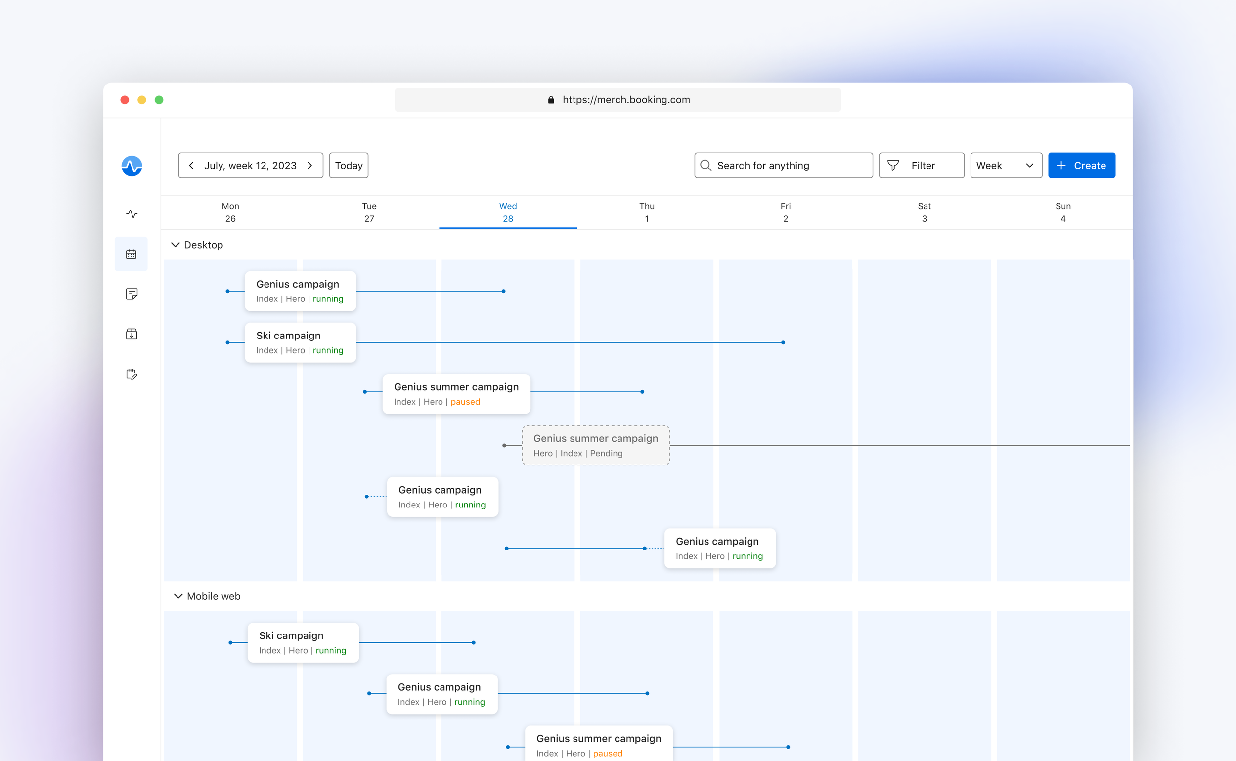
The connected patterns eventually get connected to the Merch Platform. This platform enables campaign makers to create, edit and monitor campaigns. The platform makes it easier for everyone to create campaigns with zero code. Running campaigns get monitored on performance. Campaign makers can track a campaign through certain metrics to measure engagement or click through rates.

For the Merch Platform I created the Calendar feature which enabled the campaign makers to plan their campaigns. The challenge here was to create an overview in which the user could easily see 100+ campaigns at the same time on all different platforms.
